From data to information to knowledge
- by 7wData
Data are everywhere. Turning them into Information – and then Information into knowledge – requires learning about analysis and visualisation skills from the best in the business. At the Economics Observatory, we believe this is vital for good scientific communication and effective policy-making.
Data visualisation skills are becoming increasingly important for economists and many other pursuits. In today's world, we generate data at an unprecedented rate – one zettabyte per year. You would need around 15.6 billion smartphones to store this quantity of information.
This means that for all practical purposes, data are unlimited – yet our attention remains limited. It is therefore essential to be able to communicate the insights hidden within data in a clear and concise manner. There are currently two main routes for extracting these insights:
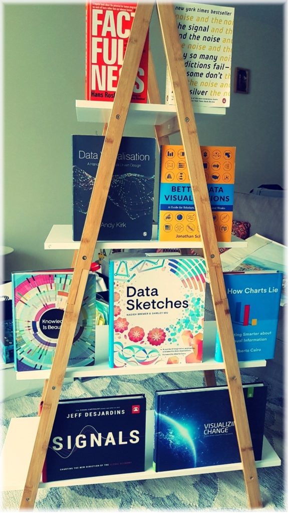
One-third of the human brain is dedicated to processing visual information. This means that data visualisation can be powerful tool, not only for making sense of the world around us, but also for unpicking vast datasets. As a result, learning data visualisation skills can provide significant benefits for anyone. In this newsletter, we take a tour of the best books that can help you to acquire and develop these core skills.
One of the primary benefits of data visualisation is that it allows complex information to be communicated in a way that is easily understandable to a wide audience. This is especially important when presenting research findings to policy-makers or the general public. Rather than presenting data in tables or charts that may be difficult to interpret, data visualisation enables scientists and professionals to present information in a visual format that is intuitive and easy to understand.
The Visual Display of Quantitative Information by Edward Tufte is the classic book of the field. First published in 1983, it has become a standard reference for anyone interested in creating effective and elegant visualisations. It includes examples of good and bad graphics, and provides practical advice on the design and implementation of graphical elements.
Factfulness is a book written by the late Hans Rosling, a renowned statistician and public health expert, along with his son and daughter-in-law, Ola Rosling and Anna Rosling Rönnlund. It offers a refreshing perspective on global trends and challenges, countering many commonly held misconceptions and pessimistic outlooks.
The authors argue that the world is much better off than we often think. Factfulnessprovides readers with a framework for understanding global trends and data in a more accurate and nuanced way. Through engaging anecdotes and data visualisations, it encourages readers to think critically about the information that they consume and to approach complex problems with a Fact-based, optimistic mindset. This is an essential read for anyone interested in global trends, data analysis or critical thinking.
Another benefit of data visualisation is that it can help us to identify patterns and relationships that may not be immediately apparent from raw data. By using different types of charts and graphs, we can quickly identify trends and highlight outliers, which can help us to make more informed decisions. This is particularly important when dealing with large datasets that may be difficult to analyse using traditional methods.
Visualise This by Nathan Yau focuses on creating effective visualisations using the three main open-source tools available: R, Python and D3.js. The book is a great resource for anyone who wants to learn these tools and provides practical guidance, including code snippets and case studies. Yau's blog flowingdata is also well worth a visit.
Better Data Visualisations – A Guide for Scholars, Researchers, and Wonks, by Jonathan Schwabish, is another comprehensive guidebook for those looking to improve their data visualisation skills.
[Social9_Share class=”s9-widget-wrapper”]
Upcoming Events
Evolving Your Data Architecture for Trustworthy Generative AI
18 April 2024
5 PM CET – 6 PM CET
Read MoreShift Difficult Problems Left with Graph Analysis on Streaming Data
29 April 2024
12 PM ET – 1 PM ET
Read More