
How to Represent Data with Intelligent Use of the Coordinate System
- by 7wData
The most widely used coordinate system to represent data is the Cartesian coordinates followed by Polar coordinates
Basically, Cartesian coordinate system uses a grid of straight lines while Polar coordinate system uses a grid of circles to represent data.
Let's now look at a few examples where with the appropriate use of the systems discussed above, we will able to visualize different aspects of the data.
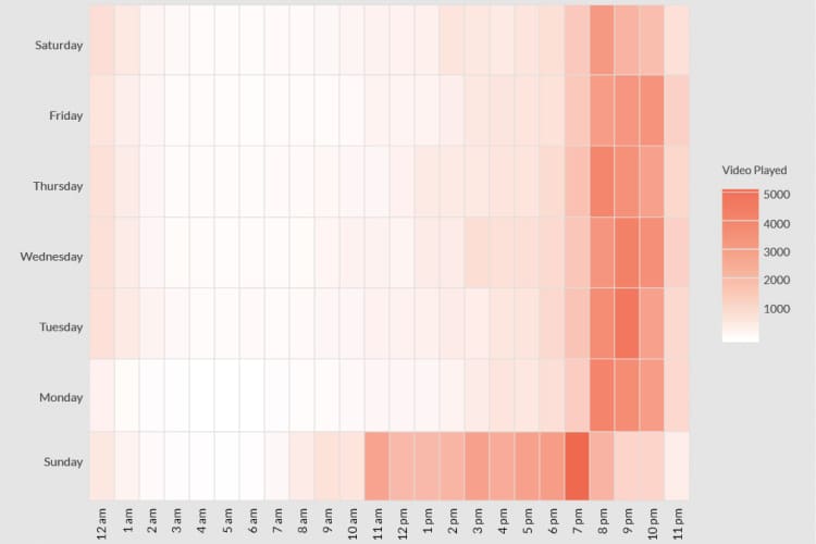
The standard graphic visualization for a categorical variable is bar charts. Bar charts are useful if you are dealing with a low number of categories within a variable.
The bar chart, above represents the App Launches by the Operating system.
Suppose, we need to check the App launches by various countries. In this case, there may be many categories as shown below:
The bar chart above makes inefficient use of space since there are many countries. In such a case, you could restrict the bars to the top 5 countries by App Launches, but you’ll end up sacrificing the information about other countries which could help you see a much bigger picture.
What if we flip the coordinate system to Polar from Cartesian?
The above plot looks better than the bar chart on cartesian coordinate system. You can instantly draw the conclusion about the top countries by App Launches.
Well, things are getting better, but still we can’t make out the proportion accounted by the top contributors unless we also indicate the percentages along with the counts.
Now, lets look at another class of plots known as Tree Maps, which is plotted on the Cartesian coordinate system. A Tree map is shown in the form of a rectangle with each country shown as nested rectangles inside it. The area occupied by each rectangle is proportional to the count of the App Launches in each country to the total App Launches as shown below:
United States has the highest share of the App Launches since the area occupied by its rectangle is the highest.;
[Social9_Share class=”s9-widget-wrapper”]
Upcoming Events
Shift Difficult Problems Left with Graph Analysis on Streaming Data
29 April 2024
12 PM ET – 1 PM ET
Read MoreTags
You Might Be Interested In
How the Internet of Things is transforming construction
22 Oct, 2016Last month on Interstate 55 outside of Chicago, an exhausted semitrailer truck driver crashed into three vehicles, killing four people. …
Governing Data Architecture to Achieve Success
10 Jul, 2016Click here to learn more about author Tejasvi Addagada. The challenges of efficiently managing data are significant in today’s in-organic …
Brain Analytics, …
22 Jul, 2017Brain mapping and data analytics advancements are improving our understanding of the brain’s functioning and opening it up as the …
Recent Jobs
Do You Want to Share Your Story?
Bring your insights on Data, Visualization, Innovation or Business Agility to our community. Let them learn from your experience.
Privacy Overview
Get the 3 STEPS
To Drive Analytics Adoption
And manage change
