Power BI dashboards present your latest data in one consolidated view, regardless of where the data lives.
Here are some tips for working with dashboards that you can put into action right now.
Working with tiles
A tile presents information from an underlying dataset. It’s a snapshot of specific data pinned to your dashboard.
It’s easy to resize, rearrange, and delete tiles on your Windows 8 or Windows 10 start screen. You can do the same with tiles on your Power BI dashboard.
What happens when you select a tile on your dashboard? It depends on how the tile was created.
If you select a dashboard tile that was created in a Power BI report, Power BI opens that report. Now you can analyze the visualization on the dashboard tile in the context of related data shown in the report.

You might want to track just a single number on your Power BI dashboard, such as this year’s sales. You can create a big number tile simply by entering “This year’s sales” in the Q&A box.
To add the big number to your dashboard, click the pin icon in the upper right corner. If you select that big number tile on the dashboard, Power BI opens Q&A with the question that you used to create it. Change the question, and Power BI creates a different visualization.


You can also hyperlink a dashboard tile to another report, a web page, or other online content. Click the pencil icon on the tile. In the Tile Details box, select Set custom link, enter a URL, and then click Apply.

Creating great dashboards
Your dashboard should not only be visually appealing, but also functional. It should be clean and uncluttered so the most important information stands out.
What should you put on your dashboard? It depends on your audience. Think about what key information they need to see to make decisions. Let that guide your choice of tiles. The flexibility of the Power BI dashboard lets you change your tiles easily.
Remember that your dashboard presents an overview—the current data at a glance. You don’t have to display a lot of detail on the dashboard because your audience can click on a tile to see the underlying reports and datasets. So it’s best to display all the tiles on one dashboard screen, avoiding scroll bars if possible.
Also think about where the dashboard is going to be displayed. If it’s going to be shown on a large monitor, you can put more content on it. If it’s going to be displayed on a tablet, fewer tiles are better.
Display important data prominently. If your dashboard tiles are all the same size, your readers might not distinguish what’s most important. This is where you can use the single number tiles to good effect.

Finally, choose the appropriate visualization. With all of the Power BI visualization options, you can pick the one best suited for your data.
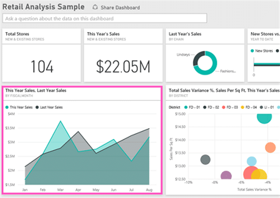
Line charts are great for showing trends over time:

Use bar charts for comparing values side by side. Sort your data by measure to draw attention to the highest or lowest number.

Pie charts are good for showing part-to-whole relationships rather than for unit comparison. If you want to display the current status of progress toward a goal, gauge charts are great.

You don’t have to be a data analysis expert to create informative dashboards that let you monitor important data at a glance, and share it with your colleagues.