
The Art of Data Visualization
- by 7wData
In my last blog, we looked at how data is aggregated based on the trend of data. In this article, we discuss how this data is represented to users in a more meaningful way.
The raw data for thousands of websites across different geographies that are measuring network components, page performance, availability, and page content metrics is saved in huge databases. When this data is presented to humans without organizing and categorizing properly, it’s difficult to read, analyze, and identify conclusions.
Presenting these data sets by organizing and categorizing in a graphical format makes it easier to achieve your goals. Here, we will look at different chart types that are used more frequently in performance analytics and that are used in various scenarios based on the data type.
To determine the chart types that represent a set of data accurately, let’s look at some real-world scenarios in performance analytics.
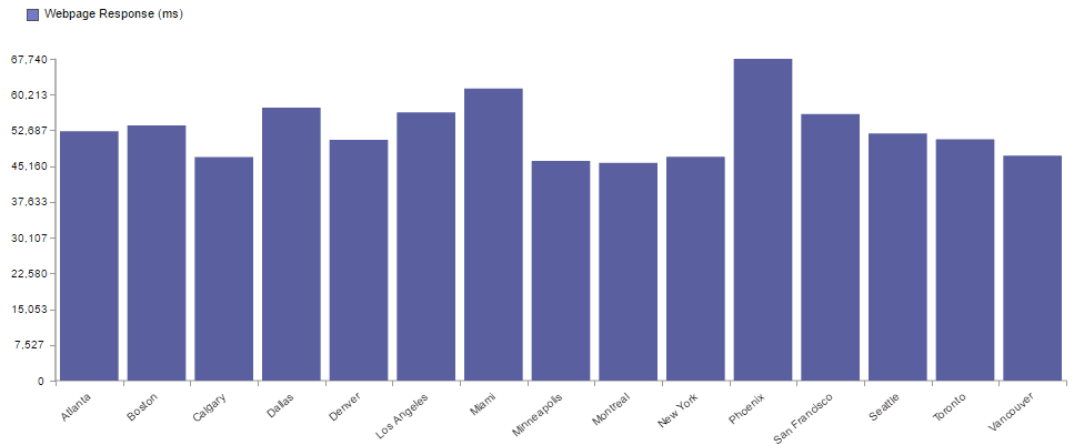
Often when analyzing performance data, we come across situations where we need to rank the data based on certain qualitative data. For example, consider the qualitative data for performance of a website across different cities in the US; let's try to determine which chart would help interpret the data in the best way.
Bar charts display the data in the form of vertical bars. This works in scenarios where we need to compare different qualitative data that can be categorized. So, bar graphs are appropriate when we want to represent ranking data in performance analysis.
Catchpoint’s digital experience intelligence platform provides the option to generate bar graphs at distinct levels of breakdown which is an effective way to represent qualitative data in a ranking order.
The above bar chart shows web page load time ranking across different cities in the US; it is easy to figure out which city performed well over others looking at this chart.
Consider another scenario where performance data needs to be studied over a period to see if there is any change in performance.
A line graph can be used to represent the continued distribution of quantitative performance data of a website over a specific period. This can determine the range of time when the performance was affected. Catchpoint can provide flexibility to plot line graph for 10 different metrics at once to provide an in-depth detail to find the root cause of the issue.
From the above line graph chart, we see that there was a change in the performance in the month of October as there was an increase in the total number of contents on the page.
So, a line graph can help understand performance variations and to analyze the root cause behind the change in performance over a period of time.
Error filtering is an important part of data analytics. It helps identify different errors, and the time the errors occurred to evaluate the availability of the website. This also helps in evaluating website availability; hence, this chart type is frequently used in performance analysis to monitor the availability of a website.
Some solutions offer an effortless way to filter different error types in a specific time frame. A scatterplot chart is a straightforward way to visualize all these errors, it plots every test run that had a failure.
The above graph shows all the errors which occurred in a specified time interval for a web test, each data point can be analyzed further by clicking on a data point and viewing the waterfall data.
A scatterplot can also be used to visualize different patterns of data for an in-depth root cause analysis. For example, consider a scenario where the page performance is impacted by the high response time of a file.
[Social9_Share class=”s9-widget-wrapper”]
Upcoming Events
From Text to Value: Pairing Text Analytics and Generative AI
21 May 2024
5 PM CET – 6 PM CET
Read More