
How Data Visualization is the Future of Information Sharing
- by 7wData
In 2012, Hurricane Sandy rocked the East Coast in a way the region was largely unprepared for. While the Gulf states have had plans in place for withstanding hurricanes, the northeast dedicated significantly less resources to hurricane preparedness. And it showed: The storm knocked out power to more than 8 million homes as far west as Michigan, and the cascading effects were felt "downstream."
And while the transportation, energy, water and communications sectors are aware of the consequences that exist should a failure of their own system occur, what happens “downstream” — to the interconnected Infrastructure sector — is not as clear, according to Fred Krimgold, director of the Disaster Risk Reduction Program at Virginia Tech's Advanced Research Institute.
“Up in New Jersey and New York after Sandy, a big problem was fuel shortage, not because they didn’t have fuel but because they didn’t have electric power,” he told Emergency Management, sister publication to Government Technology, adding that all the fuel was in tanks in the ground and had to be pumped electrically.
Part of that understanding and finding solutions to those cascading Infrastructure issues falls to Brandon Wales, director of the Office of Cyber and Infrastructure Analysis (OCIA) at the Department of Homeland Security. “Our responsibility is to really understand how infrastructures operate, how they work together, what are the connections, the dependencies, the interdependencies between infrastructure," he said, "and ultimately to understand what happens when those infrastructures fail, are disrupted or attacked ...”
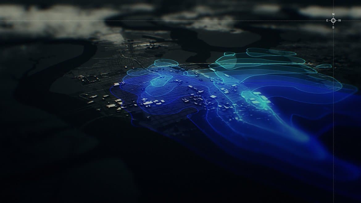
One of the most effective ways of anticipating different types of malicious and non-malicious events to both physical and digital infrastructure is through computer modeling and data visualization tools. Building interactive tools, Wales said, provides significantly higher returns than a static sheet of numbers.
Although interactive data visualizations are still in the developmental stages, Wales said he believes they are the future of data dissemination.
“I think this is the way people are used to consuming information in the 21st century, being able to interact with it,” he said. “Not just stare at a PDF file, but test it, understand it, figure out what's really most important to them and drive in on those kinds of issues."
And that, Wales added, is much more difficult to do in a 100-page PDF document.
“There is an art to displaying complex information in a way that is honest, but it also insightful and easy to use and easy to understand,” said Charles Rath, CEO of Resilient Solutions 21 (RS21), which creates interactive data visualization by producing models based on layered data. The team behind RS21 includes gamers and Hollywood special-effects folks who have worked to make their models as interactive and as interesting as possible.
Making the online tool accessible and easy to use was a conscious decision, explained Kameron Baumgardner, visual informatics lead for RS21. If something is interesting to look at or fun to use, the higher the likelihood that people will want to engage. And getting public employees to buy in is a lot easier once results can be derived and explained with visualization.
The big-data visualization tools, however, are only as valuable as the amount and quality of the data that goes in, Wales said.
“Ultimately, data is the lifeblood of the analysis and modeling that we do,” he said. “Without it, we are not going to be successful, so the more the data is available, the more that it is acceptable to us, the better that we're going to be able to do in fulfilling our mission.”
It is a two-way street, Wales explained. “The more data you share, the higher fidelity analysis that we can provide.
[Social9_Share class=”s9-widget-wrapper”]
Categories
You Might Be Interested In
How Data Visualization is the Future of Information Sharing
6 Feb, 2017In 2012, Hurricane Sandy rocked the East Coast in a way the region was largely unprepared for. While the Gulf …
How Data Visualization is the Future of Information Sharing
6 Feb, 2017In 2012, Hurricane Sandy rocked the East Coast in a way the region was largely unprepared for. While the Gulf …
How Data Visualization is the Future of Information Sharing
6 Feb, 2017In 2012, Hurricane Sandy rocked the East Coast in a way the region was largely unprepared for. While the Gulf …
Recent Jobs

Do You Want to Share Your Story?
Bring your insights on Data, Visualization, Innovation or Business Agility to our community. Let them learn from your experience.
Privacy Overview
Get the 3 STEPS
To Drive Analytics Adoption
And manage change
