
Map Design Gone Wrong Do People Even Care Anymore?
- by 7wData
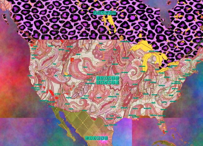
Cartographers take pride in their work, typically applying all the rules and principles of good cartographic design to their work, all in an effort to make people want to look at and appreciate their work (See Esri, Make Maps People Want to Look at). However, in this new era of social sharing it seems that the map has been replaced by the Infographic and the data visualization, a mashup of data, graphics, and maps presented in an effort to tell a story. Now us geographers are well aware of story telling via map, however, to this new breed of data visualists the focus has sadly been on quantity rather than quality. Bloggers, publishers, newspapers, etc… run to the web, download data and mashup the results in creative and not so creative ways, the end result is often a map but sadly, the product is also something your GEOG 101 Prof would likely slap you if you called it a map!
Yep, gone are the days of cartographic principles, map design standards, scale, composition, and elements of good map design.
[Social9_Share class=”s9-widget-wrapper”]
Upcoming Events
Shift Difficult Problems Left with Graph Analysis on Streaming Data
29 April 2024
12 PM ET – 1 PM ET
Read MoreCategories
You Might Be Interested In
Microsoft links Power BI to Alteryx for deeper analytics
10 Oct, 2015Microsoft has bolstered Power BI several times already since the business intelligence service became generally available in late July, …
How big data can drive employee engagement
18 Jan, 2016Big data has reshaped businesses in many ways, and now it’s even changing the way HR monitors employee engagement to …
IBM’s machine-learning crystal ball can foresee renewable energy availability
21 Jul, 2015IBM has developed a computer system that can learn about weather from thousands of data points and predict days …
Recent Jobs

Do You Want to Share Your Story?
Bring your insights on Data, Visualization, Innovation or Business Agility to our community. Let them learn from your experience.
Privacy Overview
Get the 3 STEPS
To Drive Analytics Adoption
And manage change
