
How to Make Data Sexy and Why Our Future Depends on It
- by 7wData
We have all been there before… Being asked to deliver or receive a spreadsheet of numbers, often late in the day, in a darkened meeting room… I’m falling asleep just thinking about it.
Contrast that to the glamorous world of advertising, with its photo shoots and parties, and it’s easy to glaze over when presented with data. It seems that data just isn’t as sexy as some of the other sides of marketing.
But let’s be clear, it really is!
Data is everyone’s future. Your customers, your websites and devices like smart phones and other appliances are generating terabytes of data every second.
Understanding the needs, wants and opportunities this data presents is commercially critical to all of us, but we just need to find a way to keep everyone awake, maintain the attention of the C-suite, to make data sexy…
Here are some starters:
Everything you read about analytics now is about visualization. And rightly so.
Most people find numbers pretty boring but we are naturally drawn to colorful, attractive visuals. There is a whole software industry to support data visualization, which goes a long way beyond simple charts and graphs to allow us to intuitively overlay data over geographies, time, even videos or images.
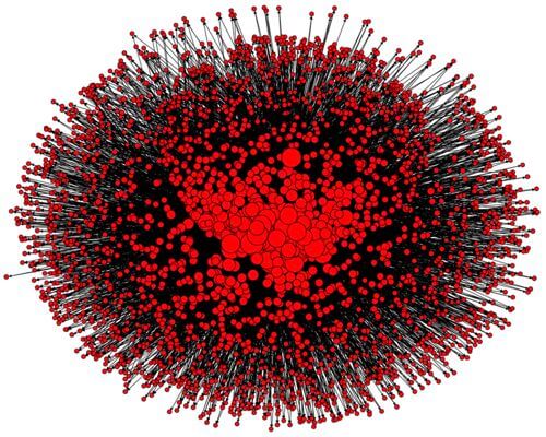
Here’s an example of how PR firm Porter Novelli constructed a visualization map of the top 50 UK PR twitter people and their followers on Flickr:
Importantly, visualization also makes these huge volumes of data accessible and digestible to wider audiences of all skills and aptitudes.
This is a huge enabler for any organization.
The challenge is to design data reporting that hits its mark, is intuitive and looks great.
That means getting a designer or creative director involved and briefing your reporting the way you would a communication or creative project.
Visualizing with a couple of pie charts is really not enough. Analytics and insights need to be works of art.
People’s eyes should linger over the work as if it was a Monet or van Gogh. Beyond pleasing the eye, our works of art need to tell a story, impart knowledge and drive insight.
My personal favorite ‘data as art’ is the map of the world as visualized by Paul Butler an intern at Facebook.
By simply plotting connections between friends and nothing else, the map beautifully tells us more about humanity, geographic and society than pages of words or numbers ever could, image courtesy of Facebook Engineering Report:
As an industry, we are pretty good at making up new and confusing performance metrics. These are all valid and important, but the higher up the management food chain we go, the less likely people are to either recognize or be interested in some of these KPIs.
Resisting the temptation to deliver and report too much, we need to be careful to both understand and include the KPIs that our audience really cares about and that help measure the business.
Anything related to revenue, cost and profitability perhaps being the top corporate list.
[Social9_Share class=”s9-widget-wrapper”]
Upcoming Events
Shift Difficult Problems Left with Graph Analysis on Streaming Data
29 April 2024
12 PM ET – 1 PM ET
Read MoreCategories
You Might Be Interested In
9 Ways How Big Data and AI Impacts the Business World
7 Dec, 2020Nowadays, the digital era has managed to create a profuse amount of data, with the amount of information likely to increase …
AIOps and the New IT Skill Sets
19 Aug, 2020This post is about how AIOps will change the way IT Operations personnel (IT Ops) work and the new skill …
The CIO AI and data: Using AI and machine learning to make data useful?
12 Mar, 2019“When discussing AI implementation with organisations. My advice is always the same: focus on the data you have now, and …
Recent Jobs

Do You Want to Share Your Story?
Bring your insights on Data, Visualization, Innovation or Business Agility to our community. Let them learn from your experience.
Privacy Overview
Get the 3 STEPS
To Drive Analytics Adoption
And manage change
