
The Hidden Bias in Customer Metrics
- by 7wData
Business leaders understand how their business is performing by monitoring different metrics. Metrics are essentially a summary all the data (yes, even Big Data) into a score. Metrics include new customer growth rate, number of sales and employee satisfaction, to name a few. Your hope is that these scores tell you something useful.
There are a few ways to calculate a metric. Using the examples above, we see that we can use percentages, a simple count and descriptive statistics (e.g., mean) to calculate a metric. In the world of customer feedback, there are a few ways to calculate metrics from structured data. Take, for example, a company that has 10,000 responses to a recent customer survey in which they used a 0-10 point rating scale (e.g., 0 = extremely dissatisfied; 10 = extremely satisfied). They have a few options for calculating a summary metric:
When I compared these summary metrics to each other, I found that they tell you pretty much the same thing about the data set. Across 48 different companies, these four common summary metrics are highly correlated with each other (See Table 1). Companies who receive high mean scores also receive a high NPS and top box scores. Likewise, companies who receive low mean scores will get low NPS and top box scores.
If each of these metrics are mathematically equivalent, does it matter which one we use?
Even though different summary metrics are essentially the same, some metrics might be more beneficial to users due to their ease of interpretation. Are there differences between Mean Scores and Net Promoter Scores at helping users understand the data? Even though a mean of 7.0 is comparable to an NPS of 0.0, are there advantages of using one over the other?
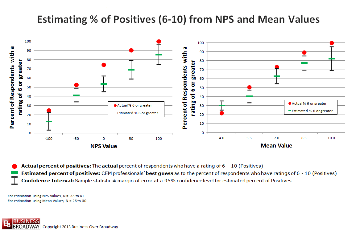
One way of answering that question is to determine how well customer experience (CX) professionals can describe the underlying distribution of ratings on which the Mean Score or Net Promoter Score is calculated.
Study participants were invited to the study via a blog post about the study; the post included a hyperlink to the Web-based data collection instrument. The post was shared through social media connections, professional online communities and the author's email list.
For the current study, each CX professional ran through a series of exercises in which they estimated the size of different customer segments based on their knowledge of either a Mean Score or the Net Promoter Score. To ensure Mean Scores and Net Promoter Scores were comparable to each other, I created the study protocol using the data from the study above. Table 2 includes a list of six summary metrics with their corresponding values. NPS values range from -100 to 100 in increments of 10. The values of other metrics are based on the regression formulas that predicted a specific summary metric from different values of the NPS. An NPS of 0.0 corresponds to a Mean Score of 7.1.
First, each study participant was given five NPS values (-100, -50, 0, 50 and 100). For each NPS value, they were asked to provide their best guess of the size of four specific customer segments from which that NPS was calculated: 1) percent of respondents with ratings of 6 or greater (Satisfied); 2) percent of respondents who have ratings of 9 or 10 (Promoters); 3) percent of respondents with ratings between 0 and 6, inclusive (Detractors) and 4) percent of respondents with ratings of 7 or 8 (Passives).
Next, these same CX professionals were given five comparable (to the NPS values above) mean values (4.0, 5.5, 7.0, 8.5 and 10.0). For each mean score, they were asked to provide their best guess of the percent of respondents in each of the same categories above (i.e., Satisfied, Promoters, Detractors and Passives).
A total of 41 CX professionals participated in the study. Most CX professionals were from B2B companies (55%) or B2B/B2C companies (42%).
[Social9_Share class=”s9-widget-wrapper”]
Upcoming Events
Shift Difficult Problems Left with Graph Analysis on Streaming Data
29 April 2024
12 PM ET – 1 PM ET
Read MoreYou Might Be Interested In
Data-Driven Inspections for Safer Housing in San Jose, California
16 Jul, 2017The Multiple Housing team in San Jose’s Code Enforcement Office is tasked with protecting the occupants of properties with three …
A framework for trusted pretained neural networks
19 Mar, 2019For humanity to achieve its unstated goal of building intelligence that will be far beyond us, I think it might …
Three-layer IoT edge system cake: Add specialized hardware, bake at low latency
3 Nov, 2017“Internet of things” edge devices are causing quite a few headaches for technology vendors and businesses alike. Their whole selling …
Recent Jobs
Do You Want to Share Your Story?
Bring your insights on Data, Visualization, Innovation or Business Agility to our community. Let them learn from your experience.
Privacy Overview
Get the 3 STEPS
To Drive Analytics Adoption
And manage change
